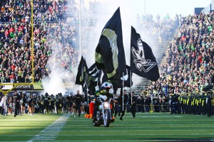
Okay, we have two great shots, but only one front cover. What to do? I know what some of you are saying: “Put the other one on the back cover.” Sorry, but that doesn’t work. There are front cover shots and there are back cover shots. Don’t try to mix them up.
It was a difficult choice between the two photographs. One has the complete overview of the stadium at the beginning of a game; the other, with the motorcycle, flags, and the team, is a closer look at the same point in time.
Even though the full stadium shot more closely resembles the cover shot of my Game Day: Behind the Scenes of a Ballpark book that I did earlier, I wanted something different for this book. Something more dynamic. More eye-catching. So, I chose the closer look. To make it look even closer, the shot will be cropped and enlarged a bit.
I feel comfortable with the choice. But, what to do with the other shot? I didn’t want to leave it “on the cutting room floor.” It’s just too darn good. That shot will be in the book, right across from the cover page to complete that layout. Perfect!
Thanks to those who made comments and sent e-mails and messages. All of you made good points, which I carefully considered in making a decision. I appreciate your input, and I hope you like the final product.

The winnah! (still to be cropped and enlarged)

Saw Eric and the Animals at Music Fest a few years ago. My daughter has a friend that got me back stage passes. My wife was with me and when we met with him he was paying more attention to her. Got our picture taken and he was hanging on my wife. I was second fiddle. Should have gone in to see him by myself!!
Can you blame him, Parker? Great story!